Facebook · product design

Relevant at a glance

PROJECT TYPE
Vision -> Delivery
Role
Product Designer
SKills
Product design, prototyping, strategy
timeline
2024-2025
When everything is relevant, nothing is.

Notifications only work when they feel relevant. I partnered with the Facebook Notification team to move from a volume-first approach to one that puts relevance and user control at the center.

The Problem

Like email, but not

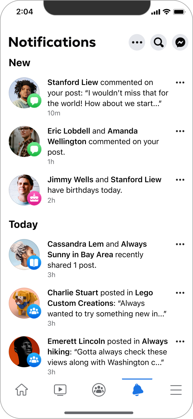
App sessions were up 20% half-over-half, but engagement was quietly dropping. Beneath the growth, users were fatigued. Notifications were high-volume, often irrelevant, and hard to visually prioritize.

User research insight

Users weren't reading, they were clearing. They came to the app primarily to dismiss their unread badge, struggled to know what to read first, and flagged too many notifications, poor organization, and inconsistent navigation as their biggest frustrations.

The behavior mirrored email: open, clear, leave. Sessions looked healthy. Engagement wasn't. That tension became the framing for everything that followed.
the constraint

Engage faster. Break nothing.

The team needed more engagement loops. Three design decisions I focused on that made notifications worth opening.
01
design decision

Showing more content

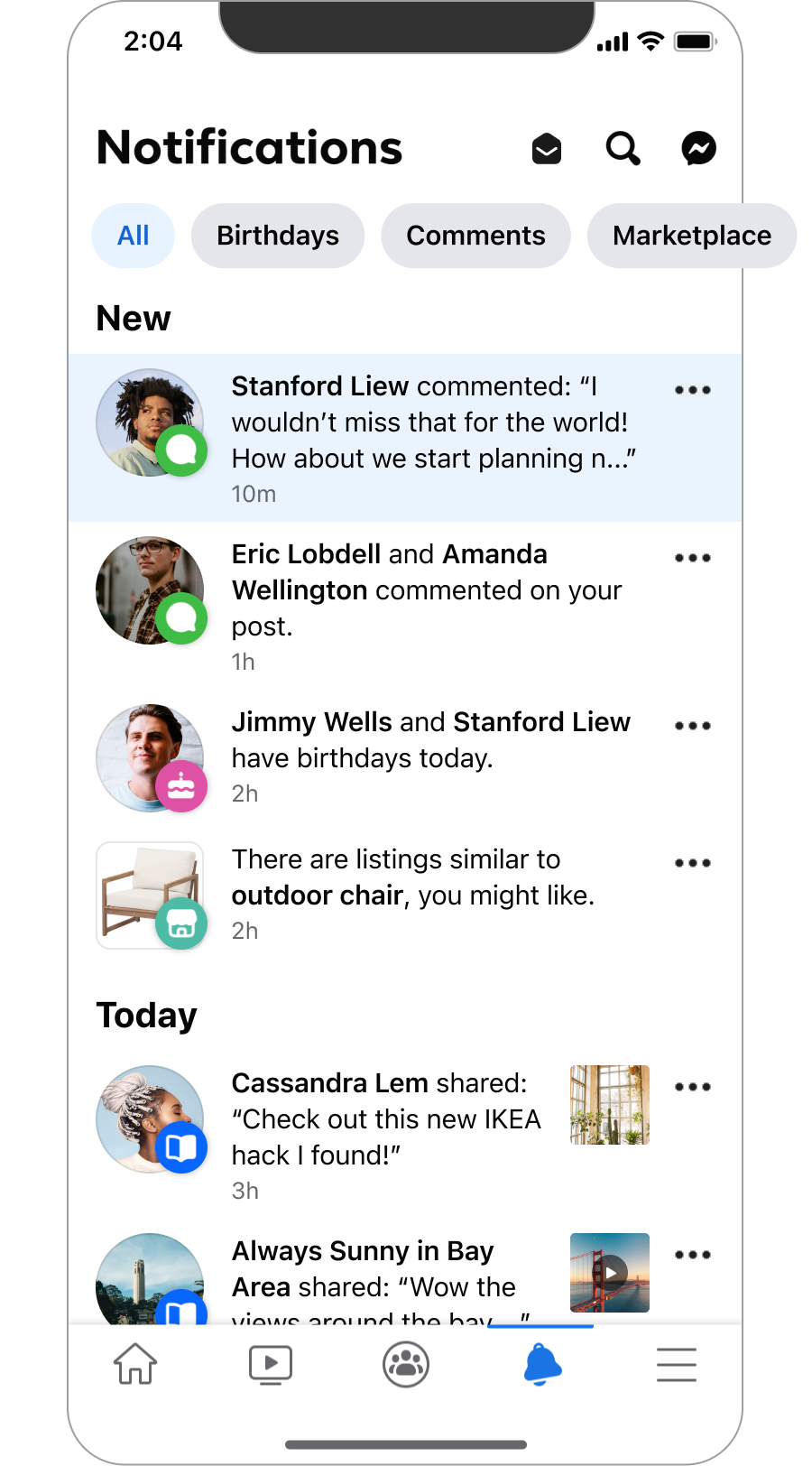
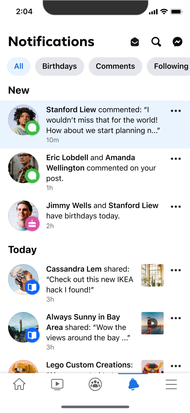
Automated text strings buried content. Simplifying strings and surfacing content previews improved user engagement. Familiarity reduced cognitive load, and the previews became a new lever for building personalization.

Improving the character count also led to improving internationalization in future iterations.

Filtered views helped users find notifications easier based on type.

02
design decision

Surfacing Filters

Users had no way to surface what was relevant. Filters scoped to high-signal notification types such as birthdays, comments and direct interaction drove notification value by relevance.

03
design decision

Let users organize and opt-in to what they want.

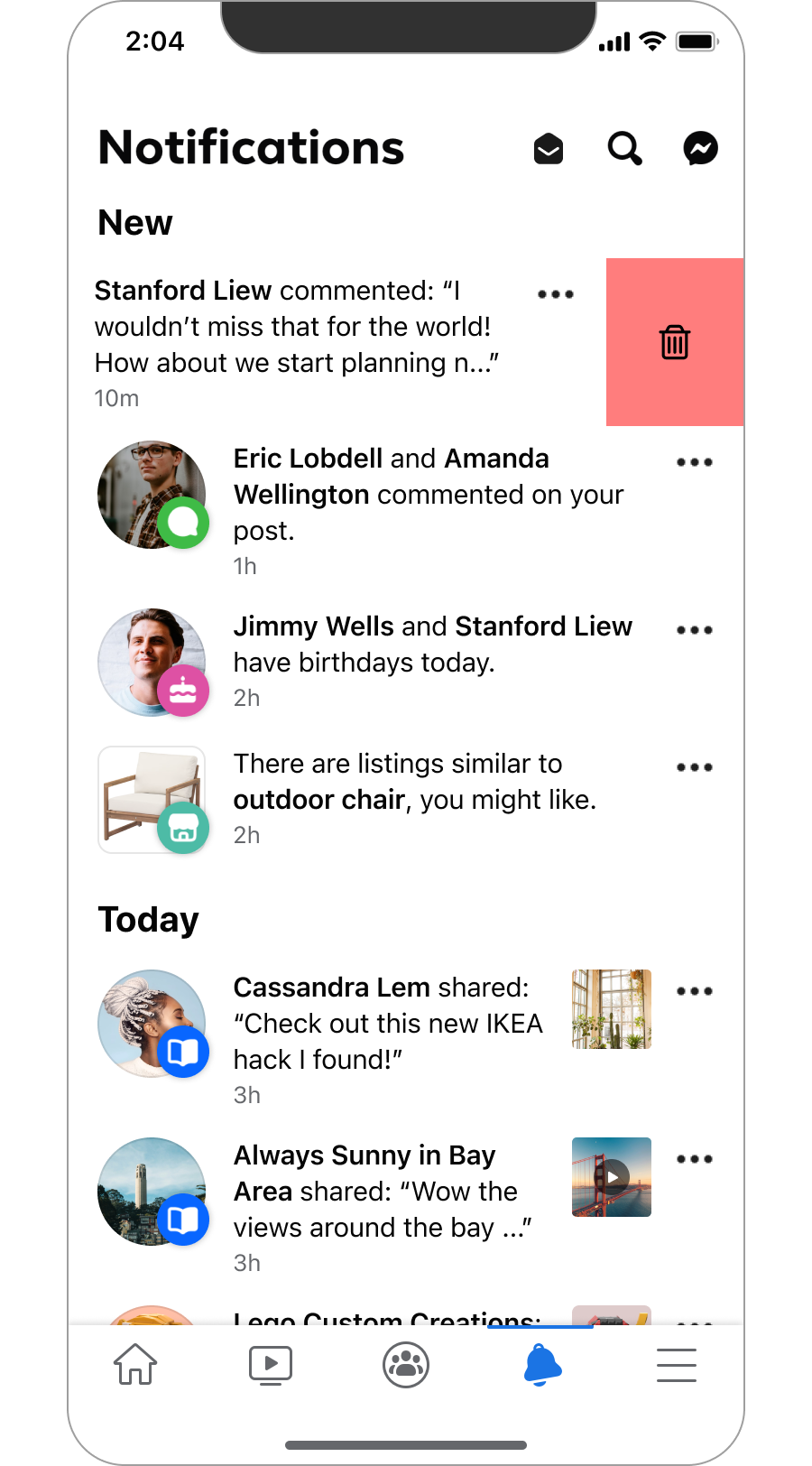
Giving users tools to organize their own notifications and removing content empowered users and gave insight into their interests.

Swipe-to-dismiss and Mark All as Read gave the app signals beyond viewing engagement.

User dismissal behavior became another source for understanding relevance.

unexpected pushback

Leadership wanted quantity. The data argued otherwise.

Early testing showed +2% in daily active engagement and comments across a 1% rollout. Leadership pushed back anyway.

Design Improvement
Leadership concern
Added filters
Reduces visible volume of notifications
Adding content previews
Loses context users need to act
Mark All as Read button
Reduces visible volume of new notifications per session
Prioritize relevant updates first in notifications
Showing more relevant notifications first will train users to ignore others

Rather than concede, I used the redesign as proof of concept: if we understand what content users actually respond to, we can build smarter personalization over time. The goal shifted from volume to signal. That reframe unlocked cross-functional support.

Impact

The redesign built the foundation. The metrics confirmed the direction.

Early Growth
2%

Engagement lift in targeted test cohort.

Apps influenced

3

Platform standards adopted by Instagram and WhatsApp teams.

Influence

1 vision

Influenced notification strategy roadmap across the Meta platform.

Before

Final

Final reflection

When notifications reflect real interests, they earn attention instead of demanding it.

01
Looking at the wrong metrics

Session looked healthy, but engagement wasn't. My instincts questioned where engagement dropped and why the real signals were being buried.

02
Design as data infrastructure

Every swipe and tap was an interest signal. The redesign wasn't just improving the platform, it was learning what users actually care about.

03
Platform-level change takes storytelling

Strong UX alone didn't win leadership alignment. Reframing the product problem, from retention volume to trust-building connected the team to broader long term goals.